EEECS Student Hub
A full rebuild of the SharePoint site 1,200 EEECS students rely on — starting from an accessibility brief, not bolting it on at the end.
Outcome
- Audited [X pages] in the page library directly, not just the live nav
- Consolidated 2 overlapping contact pages into 6 clear entry points, and 1 clumped Facilities page into 4 clickable lab pages
- Found and removed 6 orphaned pages and documents that had drifted out of the live structure
- Rebuilt the navigation as 6 accessibility-first, one-level-deep top categories
- Positive staff feedback post-launch, structure still in use after handover, with no major redesign required.
The site had grown, not been designed.
The EEECS Student Hub had accumulated years of ad-hoc pages, duplicated content, and navigation that reflected whoever last edited it rather than how a student actually looks for information. For most students that's an inconvenience. For neurodivergent students — the group I deliberately centred this rebuild around — inconsistent structure and unclear navigation isn't just frustrating, it's a real barrier to finding what they need.
The brief I set myself: if this site works well for a student who finds unpredictable structure genuinely difficult, it will work well for everyone.
What I was actually working with
- No dedicated project time — this ran alongside daily helpdesk and asset-inventory work, not instead of it
- Site permissions routed through a single staff member, who went on leave mid-project
- Content ownership was already scattered across several different staff members before I started
- Built entirely within SharePoint Online's default tooling — no custom code, by choice at the time
- ~1,200 students still depending on the site staying usable throughout the rebuild, not just after it
Starting with a full audit
Before touching a single page, I went into the site's page library directly — not just the live navigation, which only shows you what's currently linked. That mattered, because the library told a different story than the front-end did: pages and entire folders that had quietly stopped being part of the site's structure without ever being deleted.
The audit turned up six orphaned items sitting outside the live structure — a mix of pages, a dead link, and PDFs, including an outdated cybersecurity document, an old student induction guide, and abandoned Facilities and Learning pages. None had been deleted; they'd simply stopped being linked from anywhere a student would actually click.
What the library revealed
Too busy to be useful
Alongside the audit, I talked to students directly about how they actually used the old hub. The answer was consistent: it was too busy and too unclear to be worth opening. Most students had quietly stopped using it altogether and asked a friend, a lecturer, or the front office instead — the exact outcome a student hub is supposed to prevent.
The old site wasn't failing because it lacked information. It was failing because nobody could tell, at a glance, where they were supposed to look — or whether they were even in the right place.
The rebuilt hub is designed to be the first place a student looks, not a last resort. It answers the questions that come up again and again — where to print, who to contact, which lab is actually free to use — and just as importantly, it makes clear which spaces in the Computer Science Building students are welcome to use, and when. No more guessing whether a room is open to you or a locked staff area.
What changed, and why
Trade-off: I considered leaving Facilities as one long page and just rewriting the text more clearly. I rejected that — students don't browse a facilities page like an article, they arrive with one task in mind ("is the CSB open right now", "where's the VR lab"), so the fix had to be structural, not editorial.
Trade-off: I considered keeping Student Documents and PGR Student Documents as two pages and just adding clearer labels. I rejected that too — the confusion wasn't about wording, it was that a PGR student and an undergraduate needed entirely different documents. The fix was splitting the audience, not polishing the copy.
From a wall of noise to a calm first stop
Before: the homepage tried to be everything at once — mismatched tiles for Computer Society, Careers & Placement, the Assessment Hub, and Printing, a separate "Student Help & Assistance" sidebar, then a wall of ten identically styled quick-link buttons underneath. Nothing signalled what to look at first.
After: "Welcome to your EEECS Student Hub" opens with four calm categories — Student Life, Get Support, Your Learning, Report an IT Issue — plus one clear "Get things done" shortcut list below. It's not just tidier. It's fewer decisions a student has to make in the first five seconds on the page.

Before — mismatched tiles, no clear starting point

After — four categories, one clear shortcut list
One clump becomes several clear sections
Before: Facilities was one long scroll — a hero banner, an opening-hours table, then two solid paragraphs of prose mentioning three computer labs, four Innovation Labs, and a handful of specialist spaces. There was no way to click through to any of them individually; it even carried a like / comment / view-count footer, like a blog post rather than something you'd actually navigate.
After: the opening-hours table stays, because it's the one thing every student needs regardless of anything else. But "Explore Our Facilities" turns that old paragraph into four clickable cards — CSB Computer Labs, Ashby Labs, DKB Lab, Innovation Labs — plus a dedicated "Find Your Way" video section for wayfinding. The paragraph became exactly the things a student needed to click on, not read past.
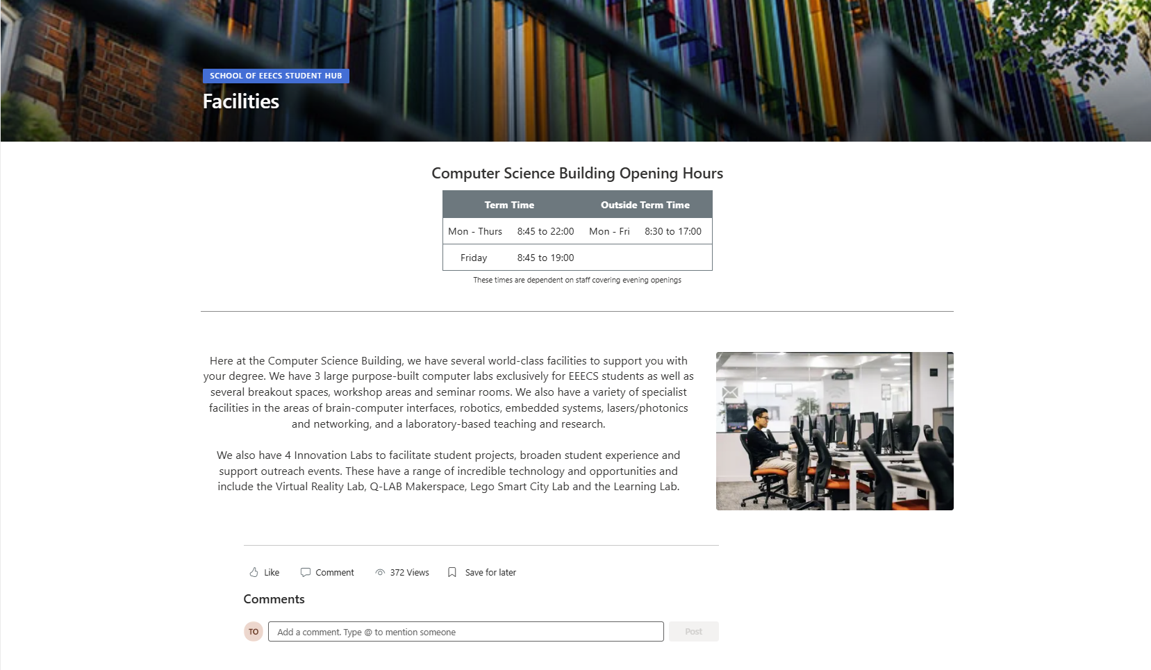
Before — one scrolling page, no clickable sections
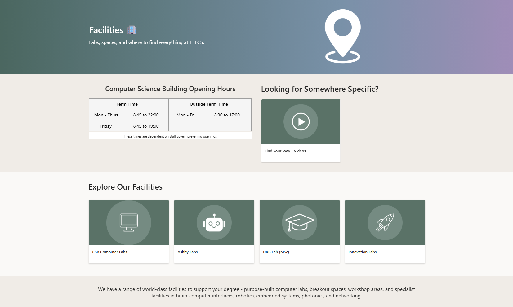
After — four clickable cards plus a wayfinding video
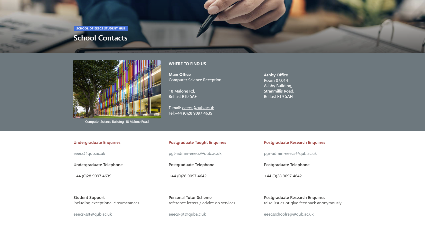
Before — "School Contacts", three audiences on one scroll
Before: "School" was still a near-empty default template — it literally displayed the placeholder text "The comments section will be displayed after page is published," visible to every student who landed on it. "School Contacts" existed separately, mixing office addresses with undergraduate, postgraduate taught, and postgraduate research enquiries all on one long scroll, with no way to jump straight to the one that applied to you.
After: "Key Contacts at EEECS" replaces both with six clear entry points — Getting in Touch, Find a Staff Member, Student Documents, PGR Documents, University Regulations, and Student Voice — plus a scannable Key Academic Contacts table. A PGR student and an undergraduate now land on entirely different, purpose-built paths instead of scrolling past each other's information.
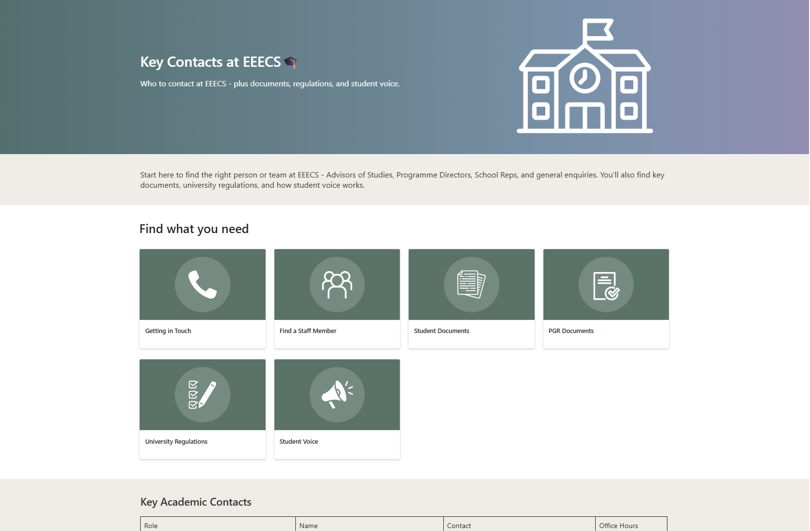
After — one hub, six purpose-built entry points
From "I can't find it" to "I knew where to look"
- Audited the page library directly, not just the live site, to find content nav alone couldn't show
- Talked to students directly about why the old hub had fallen out of use
- Restructured the navigation into a single, consistent hierarchy — no more parallel nav trees for the same content
- Rebuilt pages one at a time against that new structure, splitting clumped pages into distinct sections
- Documented ownership and contact tables so the structure stays maintained after handover
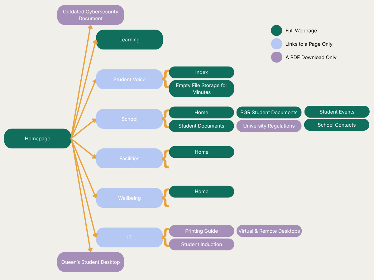
Before — mixed page types, orphaned documents, no consistent depth
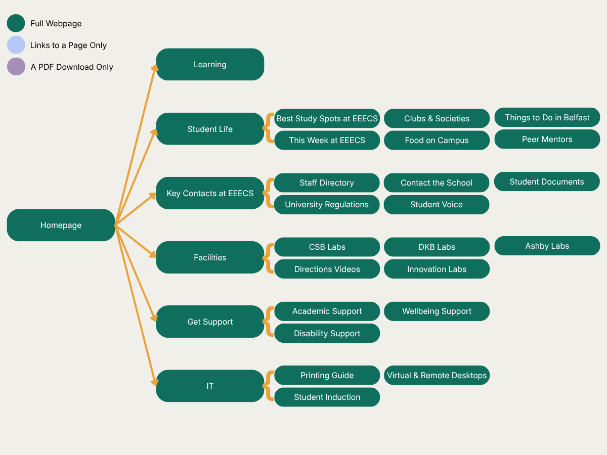
After — one consistent structure, every item a page, one level deep
Built around a placement, not instead of one
This wasn't a dedicated project with ring-fenced time — it ran alongside my normal day-to-day placement work throughout, fitted in between helpdesk tickets and asset inventorying rather than as a single uninterrupted sprint.
What I'd change with more room to move
The biggest real-world friction wasn't design or content — it was access. Site permissions all ran through one staff member, and when they went on leave for longer than I had left on placement, waiting simply wasn't an option. I adapted by designing the visual layer externally and working it into SharePoint's default page structures instead — not the plan I started with, but proof that a blocked path is something you can decide your way around rather than a dead end.
I'd also like to have gone further with code. SharePoint's built-in web parts cover most of what a rebuild like this needs, but I was curious about actually coding custom components myself — building web parts from scratch with SPFx (SharePoint Framework) rather than assembling from the template library. I didn't have time to properly explore it this time, but it's the natural next step if I revisit the site again.
What changed after launch
- ↓ Routine support queries reduced — students finding answers themselves
- ♦ Especially positive feedback from neurodivergent students
- ◎ Students locating facilities and contacts independently
- ✓ No further redesign needed since launch
Staff comments
The clearest evidence isn't my own read on the redesign — it's what the staff who deal with students every day have noticed since. Both are quoted with their role rather than their name.
"Since the launch of the redesigned Student SharePoint, we have seen a noticeable reduction in routine queries from students, particularly around finding support services, key contacts and IT guidance. Students are now able to locate information more independently, which has reduced repeated enquiries and allowed staff to focus on more complex support needs. Feedback has been especially positive from neurodivergent students, who have reported that the clearer navigation, consistent page layouts and simplified content make the site considerably easier and less overwhelming to use."
— Student Support Officer
"Since the information was brought together in one clear and accessible place, we have seen more students actively engaging with the support available to them. Students appear more confident about contacting lecturers and support staff, and there has also been increased awareness and use of facilities such as the computer labs. Making the guidance easy to find and follow has not reduced engagement; instead, it has helped students understand what support is available, where to go and how to take the next step."
— EEECS Clerical & Front Office Worker
There's been no need for a further redesign since launch — the structure has held. I've left behind a maintenance handbook so the site's upkeep doesn't depend on me personally, the same problem the original audit uncovered in the first place.
What this taught me about product decisions
Designing for the student who finds inconsistent structure hardest didn't produce a "simplified" or "dumbed down" site — it produced a more disciplined one. Every shortcut I might have taken (a duplicate nav item here, an orphaned folder left behind there) had a real cost for someone, which made the trade-offs impossible to hand-wave. That's the version of accessibility I want to carry into product work generally: not a checklist at the end, but a constraint that makes the whole design better.